
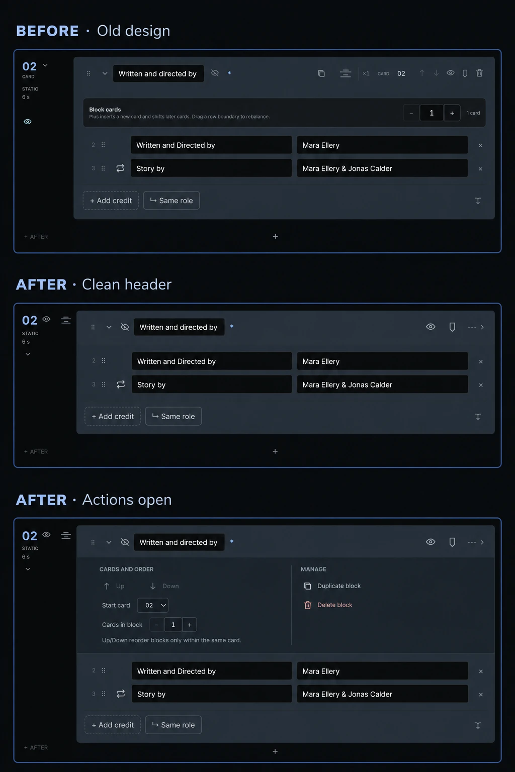
I realised the top of each block had become rather crowded. The controls had arrived one at a time, and at some point they had stopped feeling like a structure and started feeling like a collection of buttons.
So I gave the block header a clearer order. The name and the things I use most often stay within reach, while less frequent actions have their own panel. That also saves a little vertical space — something that starts to matter when a project has a lot of blocks.
I also added colour markers. There are seven colours, so a block can be marked as approved, needing attention, or simply something to come back to. The colour is quieter when the block is open and more noticeable when it is collapsed. It is only a note in the editor; it does not change the finished credits.
The comparison below shows the old design, the revised header, and the same block with its actions open. A small change, but the editor already feels a little less crowded.