I went in to tidy up a few controls in Edit Credits. A few days later, I’d reworked most of the inspector.
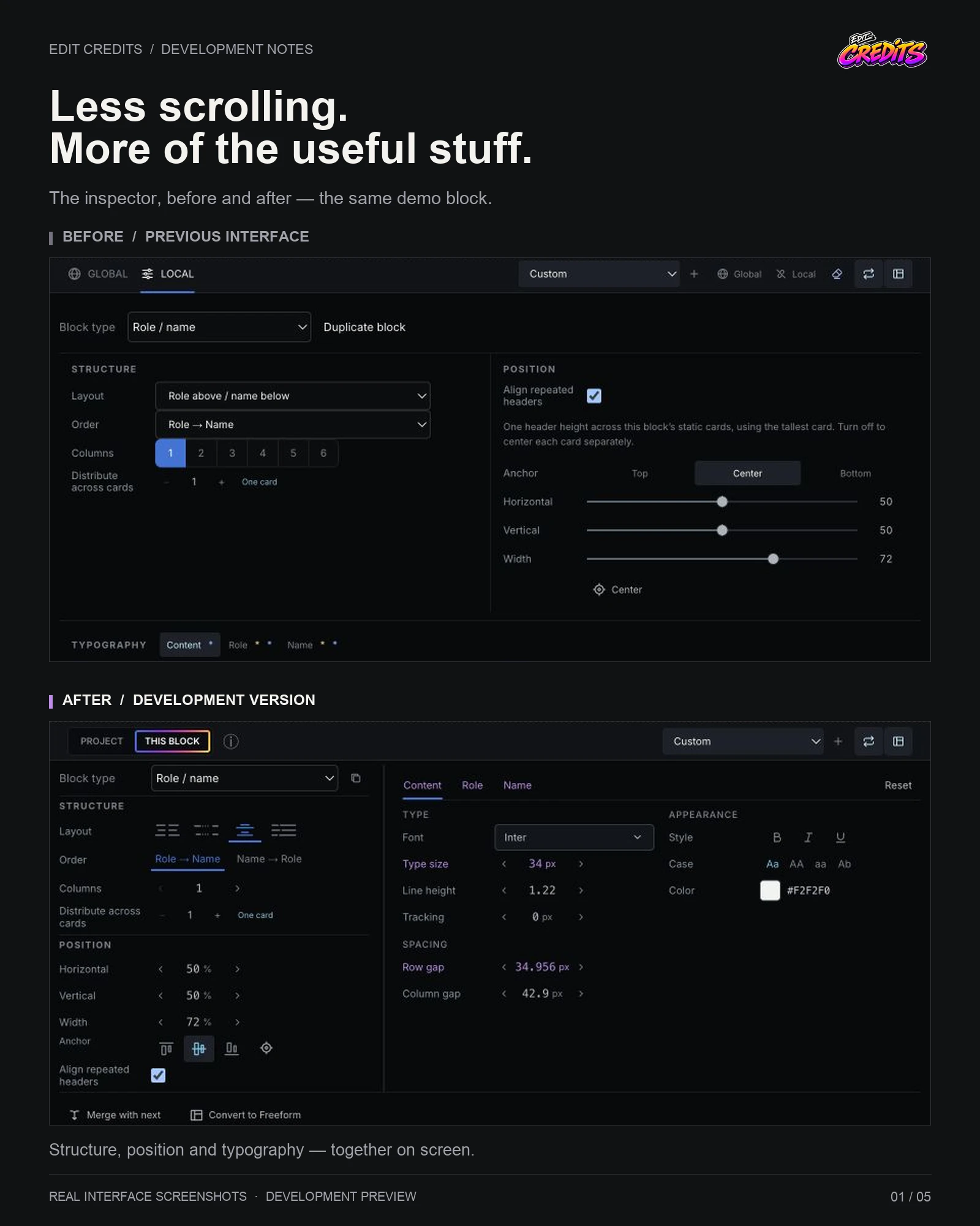
The controls had grown one feature at a time. Each addition made sense on its own, but together they meant a lot of scrolling — and sometimes stopping to work out which setting affected what. Even I was getting lost in parts of my own interface. That seemed like a good reason to sort it out.
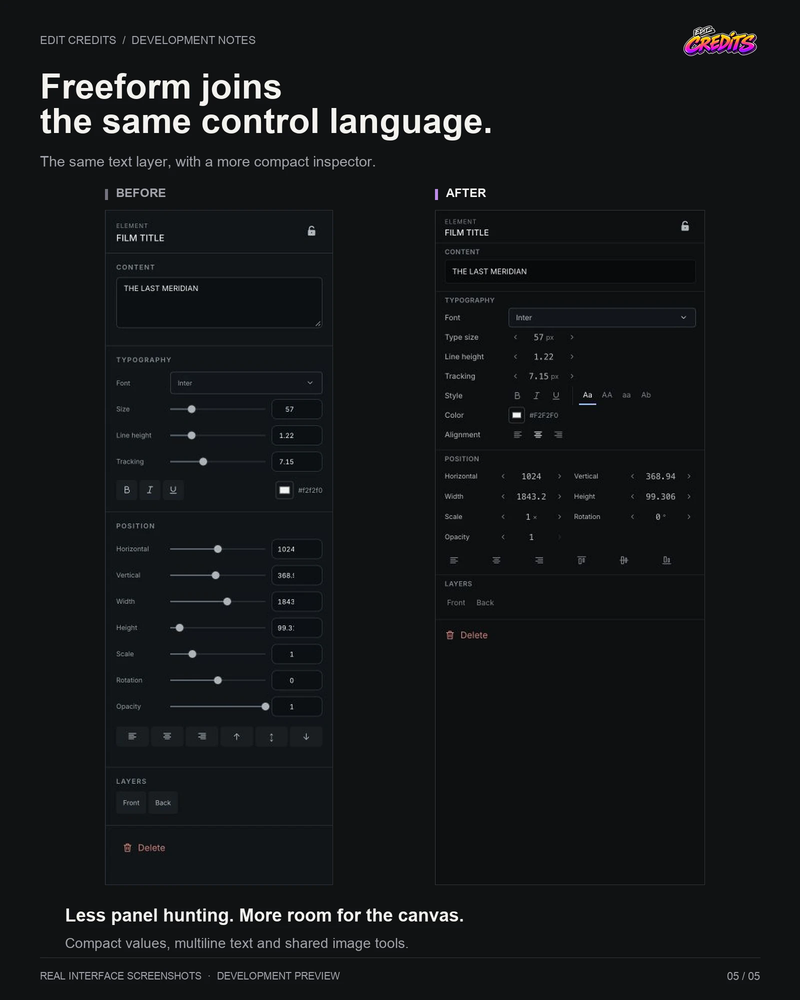
The long sliders have given way to compact number controls. You can type a value, use the arrows, or drag it left and right while watching the preview. A double-click brings it back to its default. Position, structure and typography also have clearer places of their own, so more of the useful settings fit on screen together.
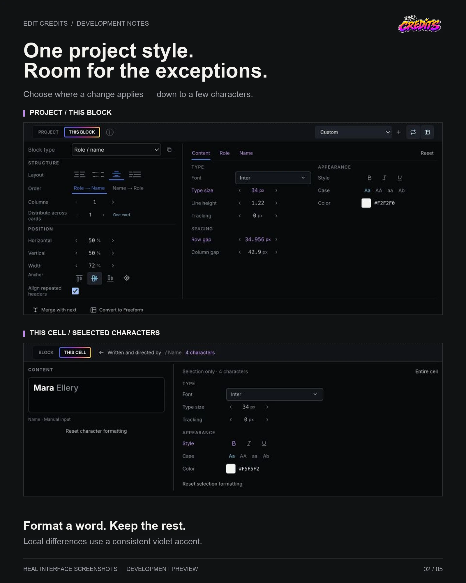
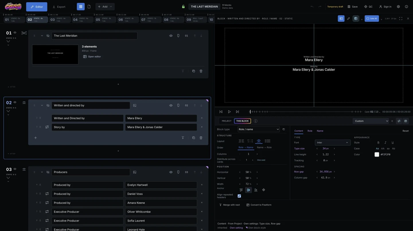
I’ve also spent a lot of time on Project / This block. The controls stay familiar; the switch tells the editor where to apply the change. Local differences have a consistent violet accent, with explanations when you need them. The same idea carries through to individual cells, and you can now format just a word or a few characters, then reset that formatting without rebuilding the whole cell.
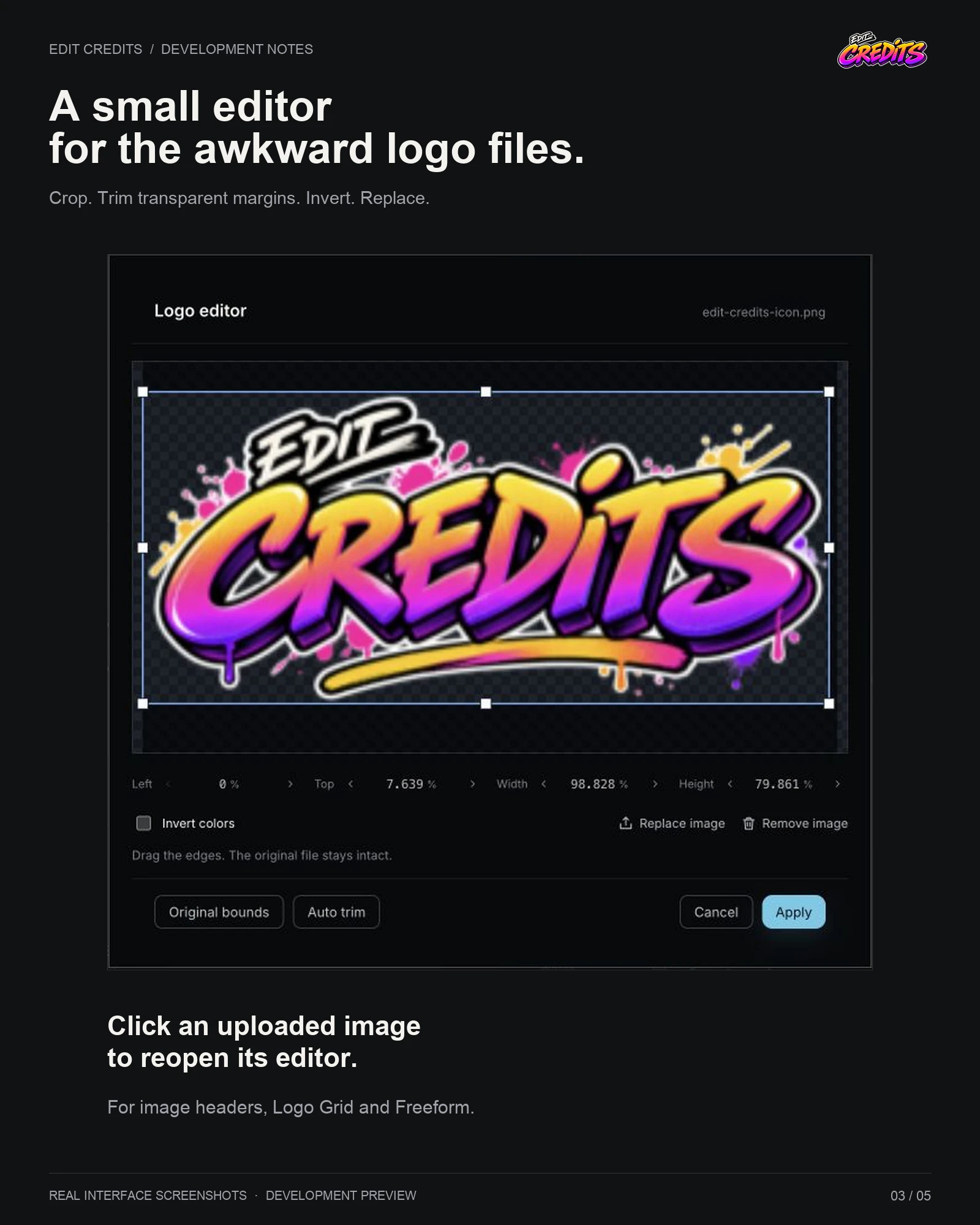
Real credits have a habit of breaking tidy examples. Names get long. Job titles get longer. A company wants its logo above its team. So I’ve extended manual line breaks to more places, including Freeform, and added image headers. Logos now share a small editor for cropping, trimming transparent margins and inverting colours. It opens after upload and when you click the image again.
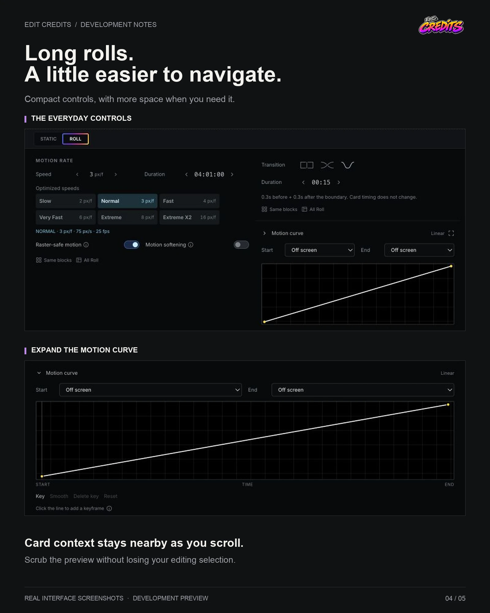
Long rolls have had some attention too: clearer project-wide and individual gap settings, card information that stays with you as you scroll, and preview navigation that lets you keep working on the selected block. The roll controls take up less room, with a motion curve you can expand when you actually need it. Freeform now has the same compact controls and text-editing tools as the main editor.
There are plenty of smaller changes around all of that — quieter block actions, clearer layout controls and a confirmation before deleting a block.
The update is now live. I’ve also been checking it against existing projects, not just a tidy new demo. The screenshots show the old interface alongside the updated version. The aim is simple: less time hunting through settings, more time getting the credits right.